Thinking in React, part 2
02 Dec 2015 - Oskar KlintrotIn part 1 we ended with this picture:
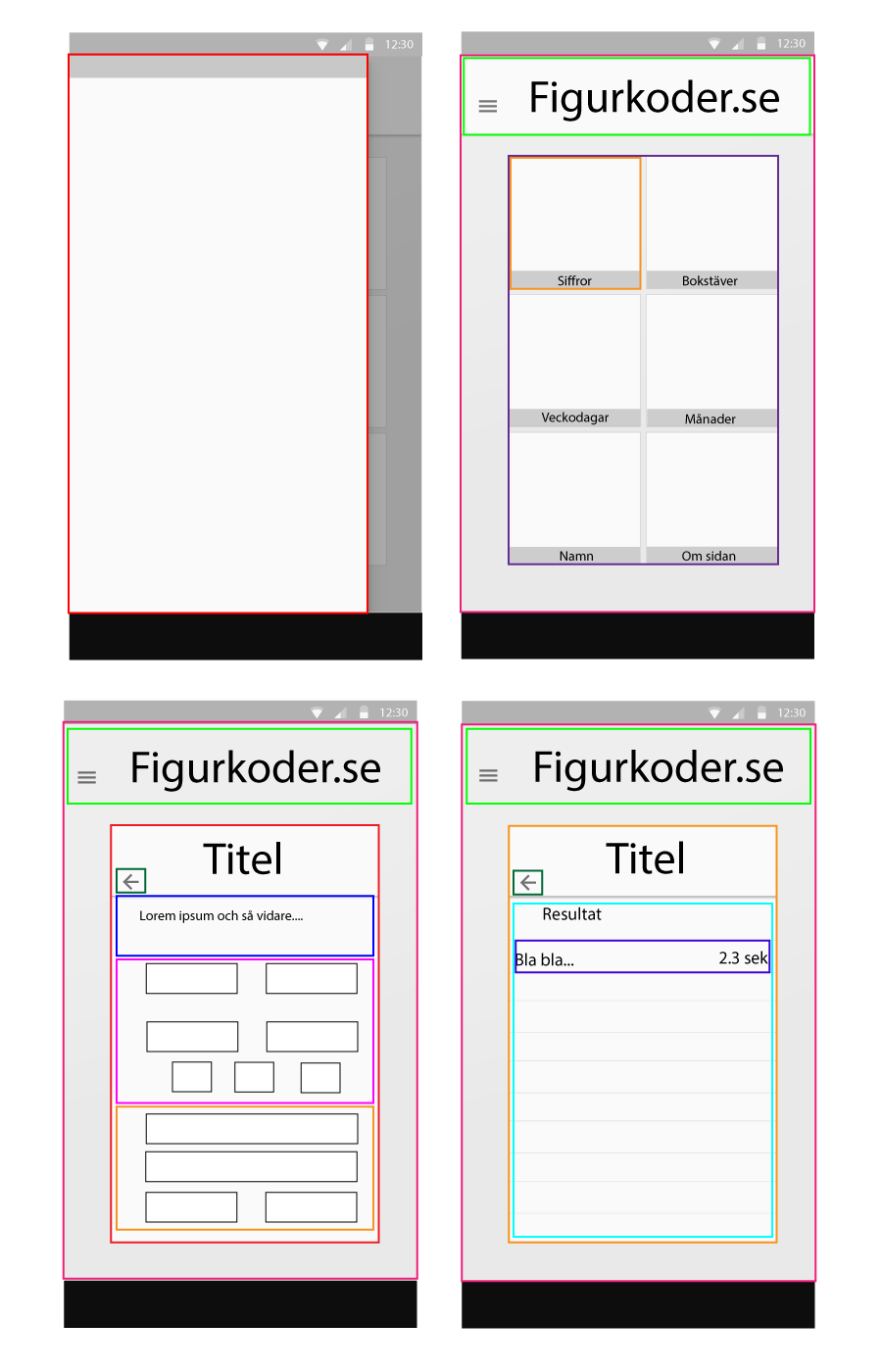 In the upper left we have the menu and to the right the start page. The bottom left mock is the actual game and to the right the result that will be displayed after the game.
Menu
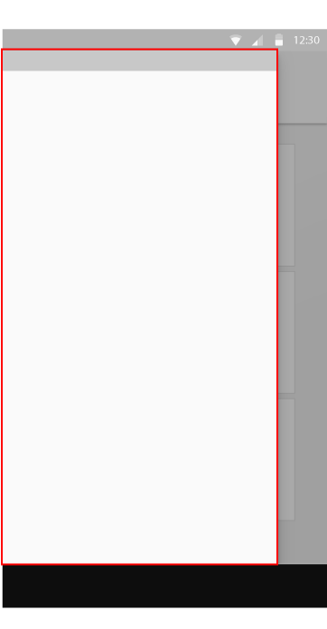
Let's start with the menu. There we can put the boring stuff like links to "About this page" etc. The menu will probably be just one component:
Menu(red)
The component hierarchy will be very simple:
Menu
Start page
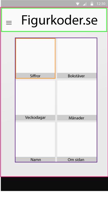
This is the first thing the user will see when entering the app. Here all game options will be put so that the user easely choose what mnemomic images the user want to practice on. Here the app needs more components:
Container(red)Header(green)Tiles(blue)Tile(orange)
The hierarchy will be pretty straight forward:
ContainerHeaderTilesTile
Game
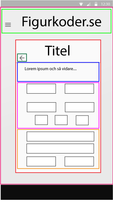
Here it's a lot more stuff going on with the description, inputs and then at the bottom the playground.
Container(red)Header(green)GameContainer(red)BackArrow(dark green)Description(blue)GameOptions(purple)Playground(brown)
Still, the hierarchy is not so different from the start page:
ContainerHeaderGameContainerBackArrowDescriptionGameOptionsPlayground
Result
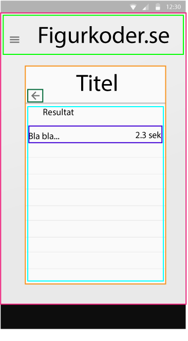
This is the last page (except maybe some "about"-page etc but that's later on, it's just not prioritized) the user will use. After a game round this is where the user will be directed to and the results of the round will be displayed here.
Container(red/purple/no idea)Header(light green)ResultContainer(brown)BackArrow(dark green)ResultTable(light blue)ResultRow(dark blue)
This hierarchy is actually the deepest:
ContainerHeaderResultContainerBackArrowResultTableResultRow
What's Next?
I am now at Step 2: Build a static version in React in the Thinking In React-tutorial. My aim is to having something to show by the end of the week, knock on wood...
Yours sincerely,
Oskar Klintrot
Tune of the day: